Don't do PowerPoint like this!
This blog relates to this video....
Embracing the art of captivating presentations involves more than just having a compelling story to tell—it's about creating an immersive visual experience for your audience. In this mini-blog, I'll share three key strategies to transform your PowerPoint presentations without the need for new technology or skills.
Harmonize with the Times:
To infuse your presentations with contemporary vibes, consider using background colors that resonate with current trends. Discover the Pantone Color of the Year by googling "Pantone color of the year" and incorporating it into your design. Supplement it with complementary colors to add depth. Opt for bold text and fonts that harmonize with the chosen color scheme. Setting your background color is simple: Navigate to Design, Format Background, Fill, and choose Gradient Fill. In the example provided, we embraced the 2023 Pantone Color of the Year, "Viva Magenta," and integrated a dynamic slide transition called "Vortex" for added flair.
Craft Striking Visuals:
Enhance your slides by creating colorful images that serve as eye-catching backdrops for your text. Pinterest is a goldmine for such visuals, often showcasing vibrant and inspiring images. For a personalized touch, design your own imagery using the color palette that aligns with your theme. Select a color theme via Design, under Variants, and insert a curved shape, progressively filled with darker shades. This unique "stacked paper" effect adds a touch of sophistication and uniqueness to your presentation.
Opt for Image-Centric Storytelling:
Shift away from text-heavy slides and embrace the power of imagery to convey your narrative effectively. While some text may be necessary, aim to minimize it by utilizing a stack of visually striking images as your primary focus. Access a plethora of stock images through "Insert Icons," and customize them to align with your chosen color palette.
Conclusion:
Elevating your PowerPoint presentations doesn't demand a complete overhaul—just a strategic integration of color, visuals, and thoughtful design. By following these three simple yet impactful tips, you'll captivate your audience and leave a lasting impression with presentations that truly reflect your unique style and narrative.- We should use background colors that 'rhyme with the time'. To find out what those are, Google "Pantone color of the year". Use the main color discussed and supplement it with complementary ones. Use bold text and fonts that resonates with the color.
- Create a colorful image as a backdrop for your text. Pinterest shows these images often.
- Avoid text as much as possible. Rather use pictures to convey your story.
Set your background color.
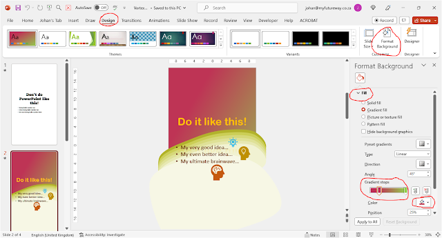
To set your background color, follow a few simple steps. Select: Design, Format Background, Fill, and then select Gradient Fill. Select colors that you want to have displayed at the various color stops. In the example presented, the base color is the 2023 Pantone Color of the Year "Viva Magenta" and one of its contrasting colors.
In addition to the background color, I also decided on a very dynamic slide transition called "Vortex".
Create an image.
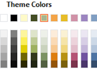
I saw a number of "stacked paper" images on Pinterest and decided to try designing my own. To start you have to have a color palette to work with. Below is the Standard MS Office color palette; below it is the Paper Theme palette. Notice the subtle difference in colors:
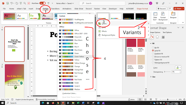
To get a new theme do the following: Click on Design, under Variants, click the down arrow to open Colors. There is a wide variety of colors to choose from. Choose one that will suit you, or create a brand new one to align with your brand colors.Insert a curved shape as illustrated below. Make sure the curves close, so that you have a new freeform shape. Make several copies of the shape and fill each copy with a successively darker shade of your chosen color theme. The darker ones should be behind the lighter ones.
Use pictures.
You can now use the stack of images as the basis for your text, but ideally, you should use the minimum of text and rely on imagery to get your message across. (Of course, in most slides you will have to use at least some text.)
By simply clicking on Insert Icons, a world of stock images becomes available to you. In a variety of formats. Many of them can be customized with any color.
My PowerPoint as promised.
This is the PowerPoint I used to create the video.
Udemy hosts a course on Interactive PowerPoint Animations that I created. So, please visit it. PowerPoint presentations used in the course can be used as templates for your own animations. Moreover, I sometimes have discount coupons for the course to give away. I post the coupons on my Facebook page, but they go quickly, so I offer them to my mailing list first. Please send me an e-mail johan@myfutureway.co.za





Comments
Post a Comment
Please include your e-mail for further information.